I was commissioned by the National Enterprise Network (formerly the NFEA) to lead a comprehensive rebranding initiative. The objective was to develop a modern visual identity that reflected the organisation’s new name and its evolving role within the shifting enterprise support landscape.
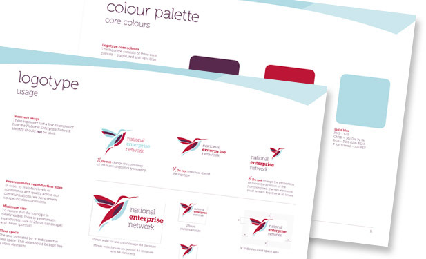
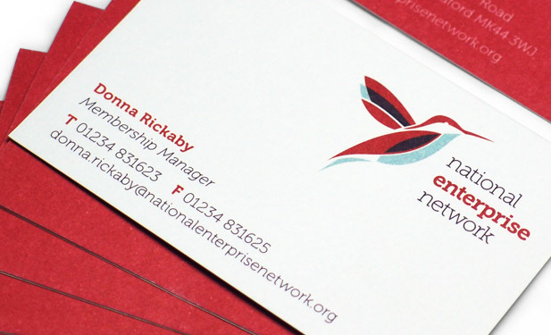
The resulting identity centres on a hummingbird motif – a strategic choice symbolising optimism and the ability to achieve high-level results under challenging conditions. Rooted in applied colour psychology, the brand utilises a Group 3 palette to project an atmosphere of energy, authority and trust. This cohesive system reinforces the Network’s position as the definitive membership body for the UK’s enterprise support sector.
Design applications
• Applied colour psychology analysis
• Brand and logotype
• Brand guidelines
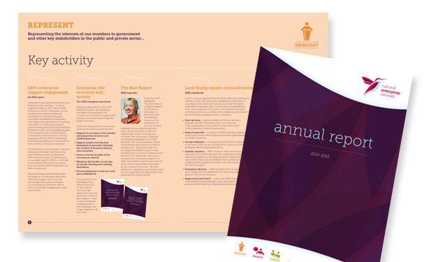
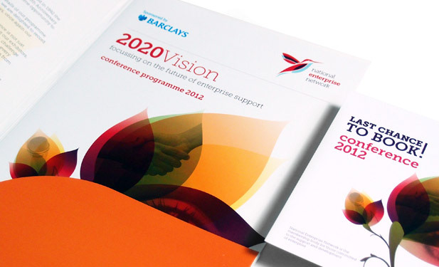
• Literature
• Conference printed materials
• Conference AV materials
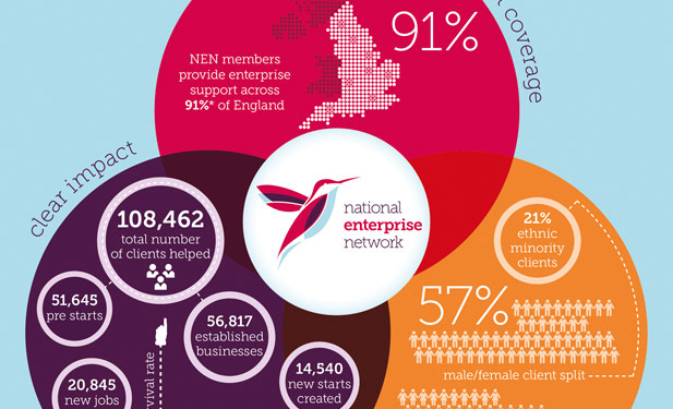
• Infographics
• Stationery
• Applied colour psychology analysis
• Brand and logotype
• Brand guidelines
• Literature
• Conference printed materials
• Conference AV materials
• Infographics
• Stationery
Testimonial
“The consideration Kate gave to our requirements was of a very high standard. The design suggestions were well thought out, unique and highly effective.”
--Hayley Williams, Head of External Relations, NEN--
“The consideration Kate gave to our requirements was of a very high standard. The design suggestions were well thought out, unique and highly effective.”
--Hayley Williams, Head of External Relations, NEN--