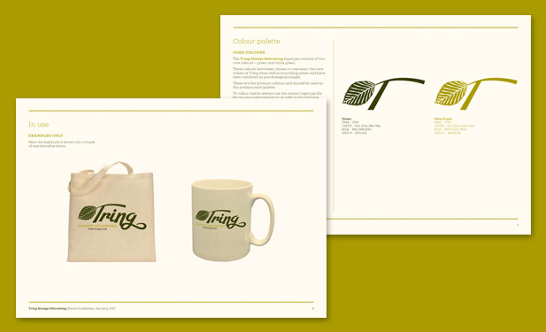
I was commissioned by Tring Town Council to develop a cohesive visual identity for the town’s tourism sector. The primary objective was to create a versatile logo that could be adopted by the local council and private businesses alike to foster a unified cross-promotional network.
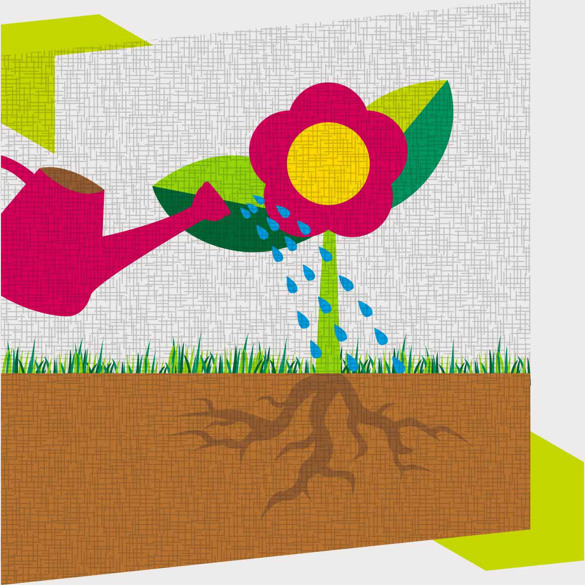
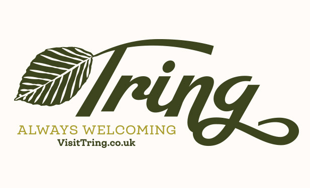
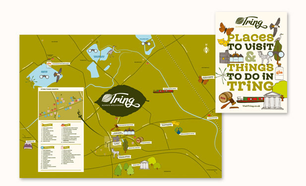
The brand mark features a stylised beech leaf integrated into the typography, symbolising the iconic treeline of Tring Park and its status within the Chilterns Area of Outstanding Natural Beauty. This identity was launched via an A3-to-A5 gatefold collateral piece, featuring an illustrative map. The map serves as a functional directory, highlighting key cultural and commercial landmarks, including Tring Market, local nature reserves and independent hospitality venues.
Design applications
• Brand and logotype
• Brand guidelines
• Illustrative wayfinding map
• A5 leaflet
• Brand and logotype
• Brand guidelines
• Illustrative wayfinding map
• A5 leaflet