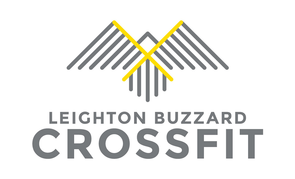
I was commissioned to develop a comprehensive visual identity for a new CrossFit and personal training facility based in Leighton Buzzard. The brief required a sophisticated brand mark that integrated a stylised buzzard graphic – a nod to the local geography – with modern, clean typography to ensure high legibility and brand recall.
The visual strategy is rooted in applied colour psychology, specifically utilising a Group 4 palette to communicate excellence, expertise and a commitment to high standards. The primary yellow was selected to project confidence and optimism, while the neutral grey serves as a grounding secondary tone, reflecting the brand’s professional and steady foundation.
Design applications
• Logotype
• Logotype