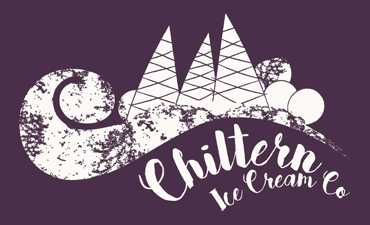
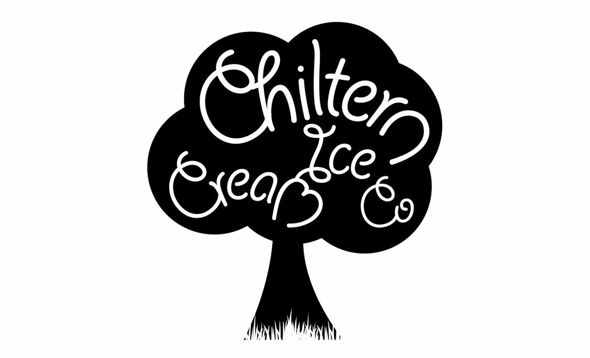
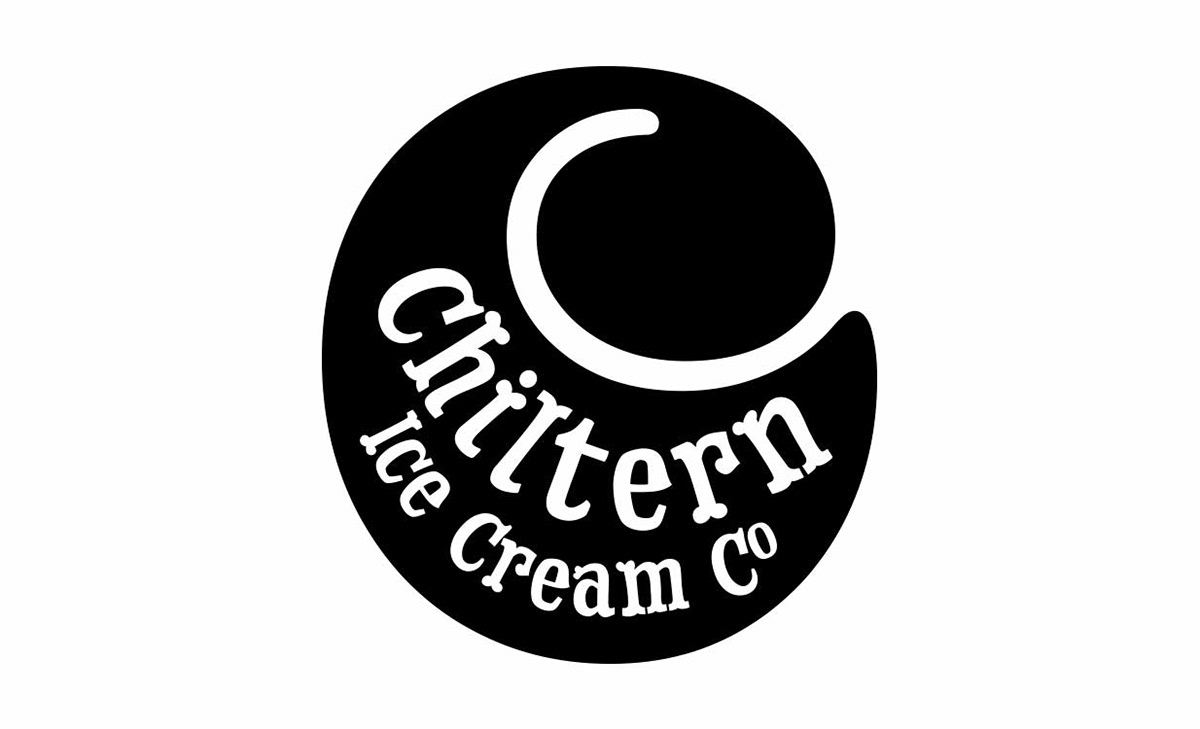
I was commissioned to develop a high-impact brand identity for The Chiltern Ice Cream Company, with a brief to position the brand as ‘edgy and adventurous’ within a competitive artisanal market. Following a multi-concept exploration phase, the final identity centred on a bespoke illustrative landscape. This design features a stylised representation of the Chiltern Hills, ingeniously constructed using ice cream swirls and cones to merge the product with its regional origins.
While the initial creative direction favoured a monochromatic black palette for a minimalist, premium feel, the strategy evolved to incorporate a signature purple. This addition served as a crucial piece of brand storytelling, acting as a vibrant nod to the client’s heritage and formative years in New Orleans.
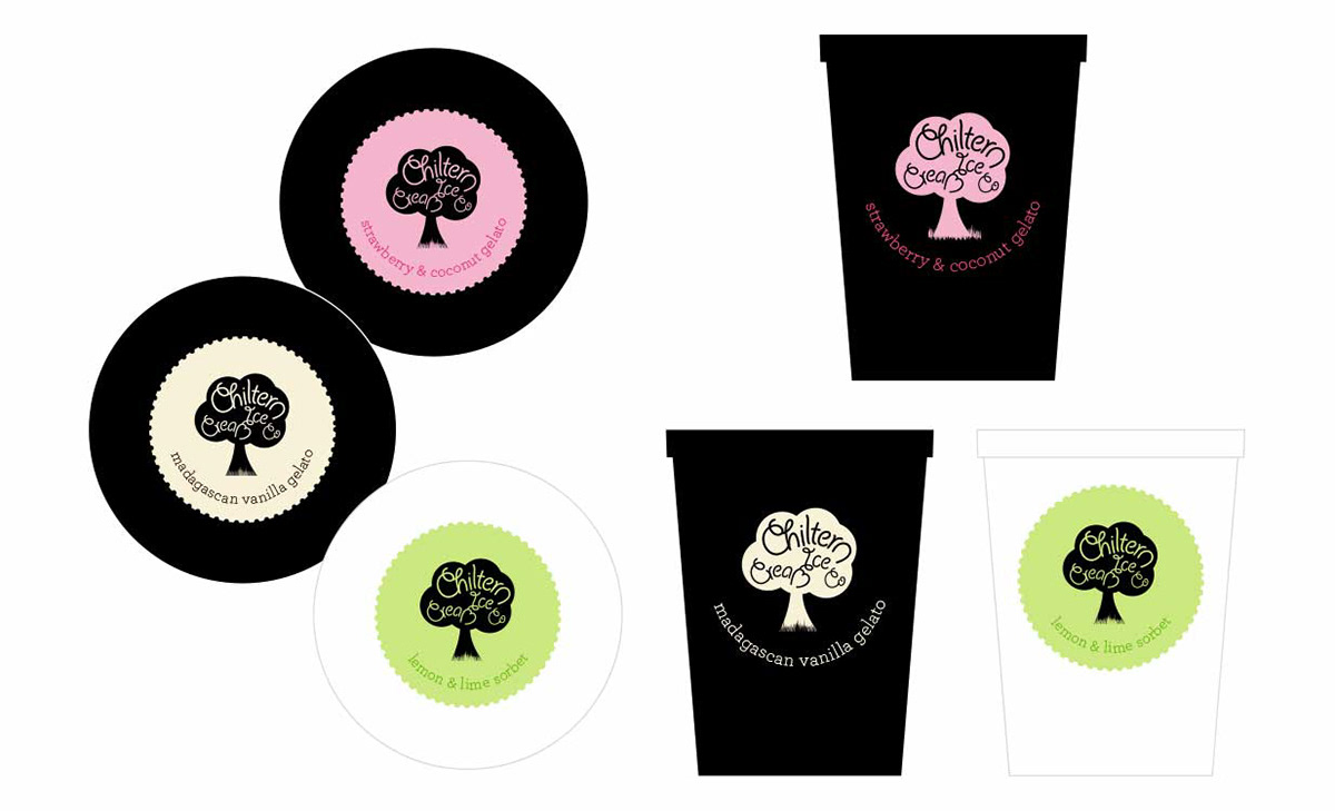
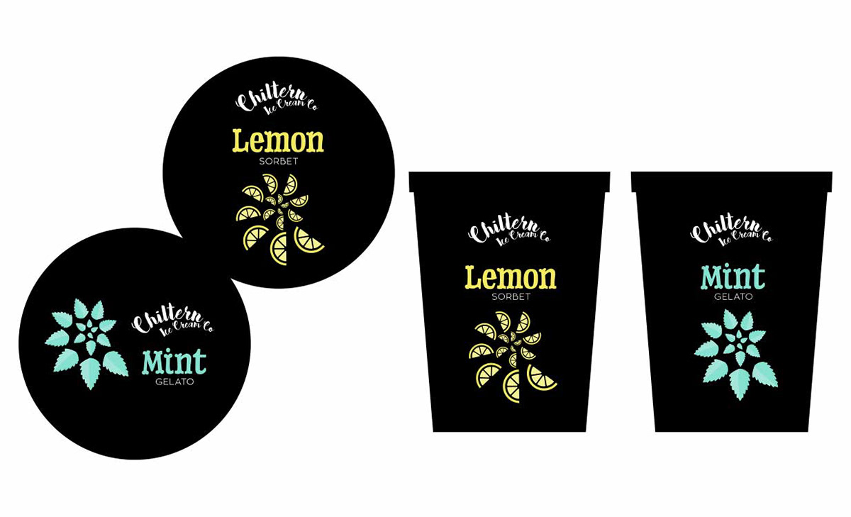
Design applications
• Brand and logotype
• Label design
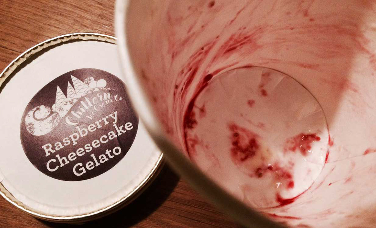
• Brand and logotype
• Label design